Hello, I'm Jared Ashton Gourley Parmenter
I am a front-end developer, writer, and digital media specialist.
I have a passion for minimal, responsive designs which put content first.
I love puzzles, problem solving, and bringing technology to life.

From bringing academic events to life through design, to massaging back-end interfaces, to retrofitting older websites with responsive architecture, and even blogging for hire, my path has meandered quite a bit across the web.
My mission is to design creative solutions to complex problems, leveraging a wealth of experience across digital media to exceed my client's expectations.
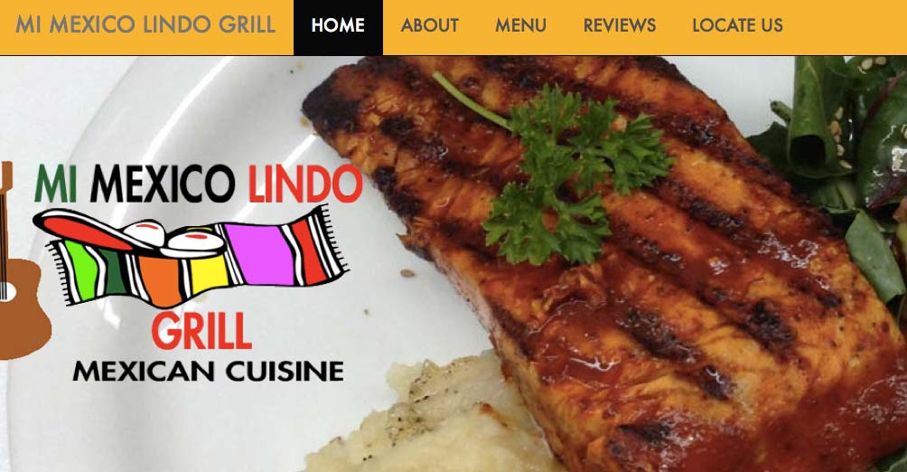
My most recent projects are developing an upbeat, attention-grabbing website for Mi Mexico Lindo Grill, and overhauling this personal website.
After a career in social media, web management, and digital content production from 2010-2014, I'm now taking the time to grow some new synapses.
It was a big decision, full of enormous challenges, and exciting opportunities. But, I love learning, and I'm embracing a life of forward momentum!
With that in mind, I'm putting myself through Code School, experiencing the Poignant side of Ruby, hacking together new designs at Hack Design, and exploring typography and design principles at Skillshare.
I'm currently looking for full-time employment, as of November 2014. Are you interested in hiring a passionate, bright, energetic, professional Junior Front-End Developer?
Please feel free to reach out on social media, or contact me directly.
Newly opened restaurant "Mi Mexico Lindo Grill" needed a website to advertise their new location. They needed a design which reflected their committment to authentic Mexican cuisine passed down by the chefs' grandfather, while highlighting their new location to their largely mobile customers.
Additionally, they required a design which melded with assets they had already created at a first location, including bright colors and a festive Mexican-influenced logo.
My solution was a single-page mobile-friendly site which puts their menu first, with an attractive, jubilant energy.
In combination with some custom online reptation management on Yelp and via AdWords, their business is up over 4000%!
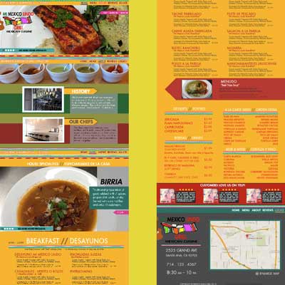
I created several mockups in Photoshop, presenting different styles and color palettes. These serve as reference points to guide our initial design decisions.
The selected mockup is shown on the left.
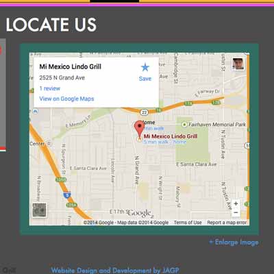
The client wanted a simple, accessible map with interactive navigation.
Google Maps provides an excellent, fast, personalized embeddable map for easy navigation without leaving the page.
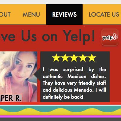
The site uses a single page with all relevant information, for a simple mobile experience.
The navigation uses Scrollspy javascript for contextual highlighting.
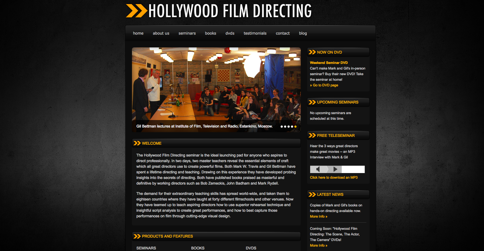
HollywoodFilmDirecting.com had a website designed by a developer who had abandoned the project after approximately 80% of the original intended design was complete.
I helped them clean up the codebase, modernizing certain elements like the Javascript image sliders, optimizing content and metadata for proactive SEO, and a favicon was deisgned.
Re-designed layout to include buttons and links for social media, and additional video and photographic elements.
Contact and bio pages for each company member were created, with appropriate image and stylistic themes continued from original site. Payment processing for several products integrated via PayPal and custom navigation and button elements.
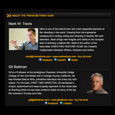
Added explanatory details, including updated templates, reworked images, quotes, and background material.
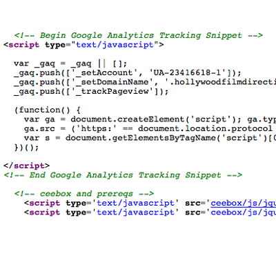
Developed a payment processing system, utilizing PayPal, and embedded the necessary buttons and graphc elements to direct the user's attetion to them on each relevant page.
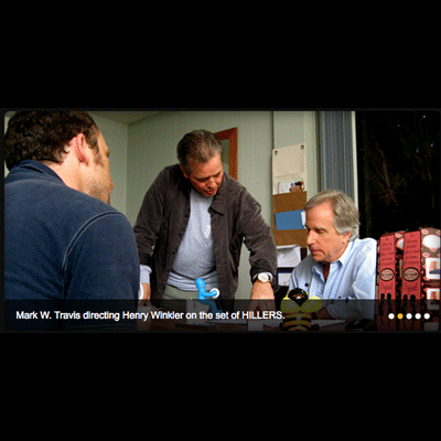
Undid the previous graphic designer's Photoshop layer issues, creating clean images with clear explanatory text for each of the site's overlaid photographs.
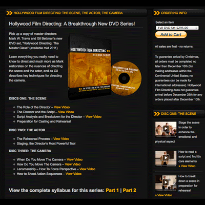
Added product pages to the website, clearly explaining the contents and layout of each DVD the client sold through the updated website.
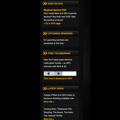
Iterated on the previous sidebar designs, integrating new elements and streamlining the old ones. Pictured: an audio widget selector.
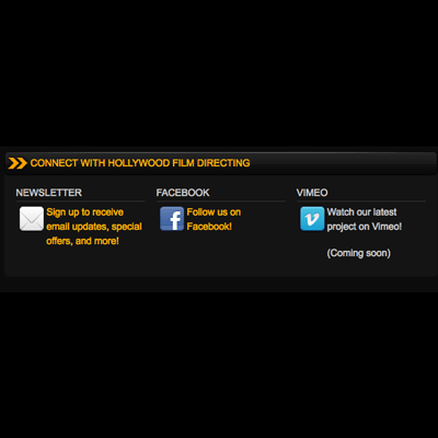
Implemented brand new icons for each of the page's essential elements, selecting and enhancing an array of images to complement the site's graphic design.
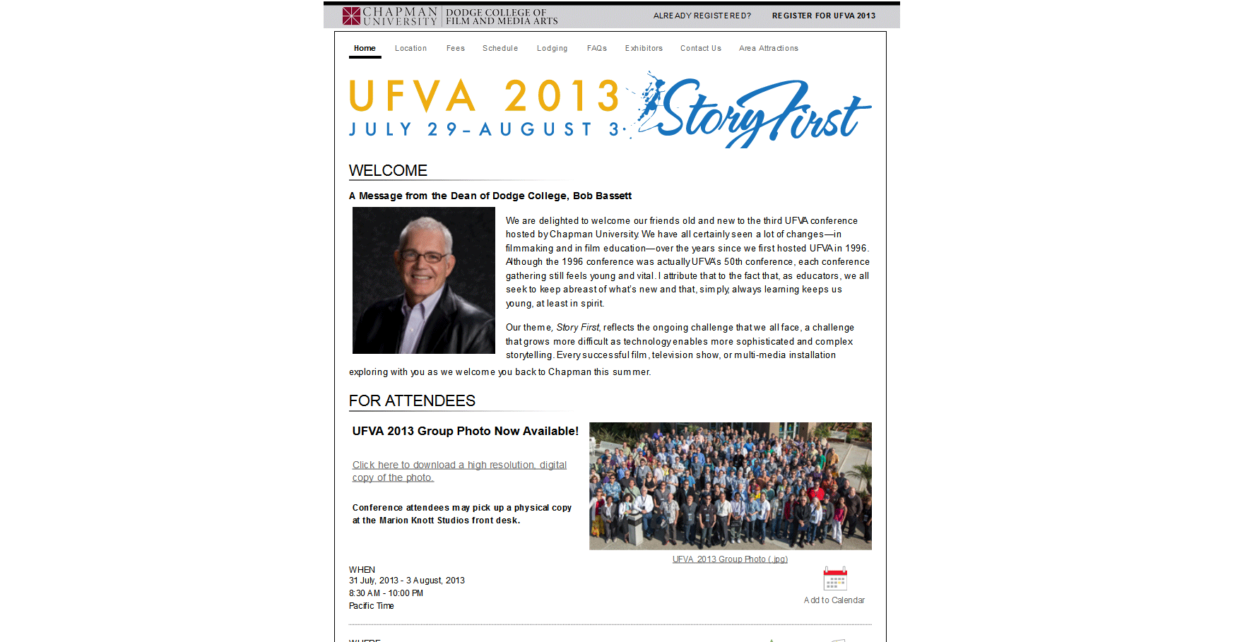
Chapman Unviversity hosted the 2013 UFVA conference in Orange, CA, and I was responsible for designing the implementing the registration website.
We used a backend software package called Cvent to manage registration, which was also used as a very design-limiting CMS.
As the site did not allow images, mobile responsive designs, file hosting, or theme customization, I implemented all of these manually via clever CSS.
Additionally, I designed a template for digital slide displays, color-corrected and laid out the conference group photo, and mocked up a pure-WordpPress treatment of the site in the planning stages.
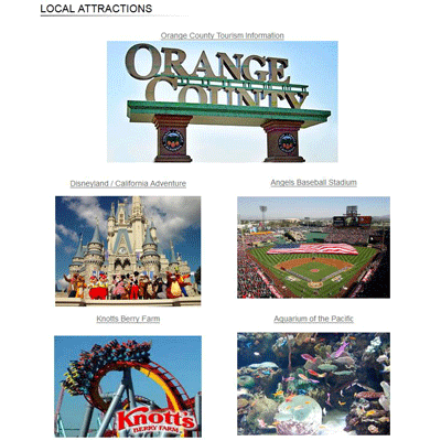
Pages beyond the default scope of the CVENT software had to be created by hand, including this Attractions page.
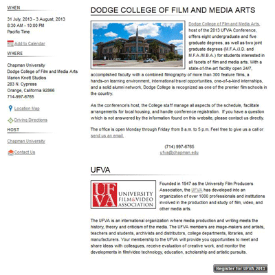
Another example of a custom page.
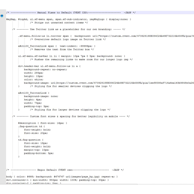
The registration software's theming options were extremely limited, and would reject new makrup insertions. I hacked their packaged and inaccessible branding and icons to use as placeholders, which their backend would read.
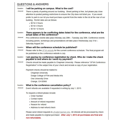
Even the utility classes which were included in their CSS had to be hacked, since there was no access to them in the backend.
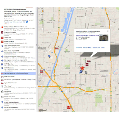
I created a list of important Conference locations in a Google map, and hacked their default Bing map to load a thumbanil of mine instead.
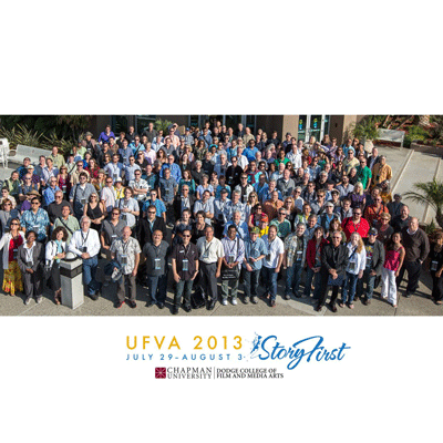
The professional photgrapher's group photo was extremely contrasty, so I color-corrected it and added our logos, then framed it all in a bold layout and distributed it to 500 guests.
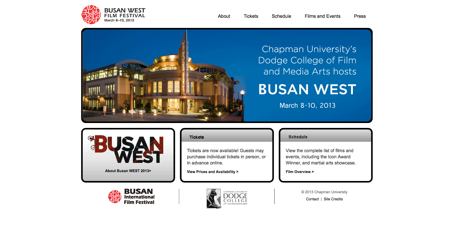
In its third year, the BusanWest Film Festival wanted a quick, impactful graphical redesign, a handful of new pages, and enhanced functionality.
I designed new background images, navigation links, logo and identity, to fit into the existing layout.
To make upgrading the site in the future easier, I gutted site navigation and file structure, separating recurring elements from annual content. Dynamic sidebars, updated CSS3, and better-commented code make updating the site a breeze.
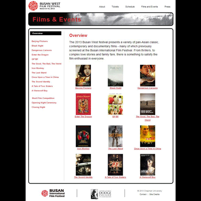
The main landing page for the films played at the festival was completely retuned to match the site's new look and feel.
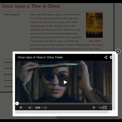
Each film's details page was updated with lightweight javascript to allow for automatically resized pop-up boxes containing a variety of multimedia content.
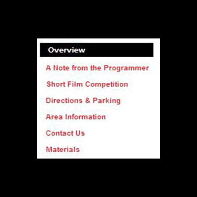
The site's navigation elements were a patchwork of mismatched site/document-relative filenames. The system was overhauled by dynamically including the sidebar content at runtime via PHP.
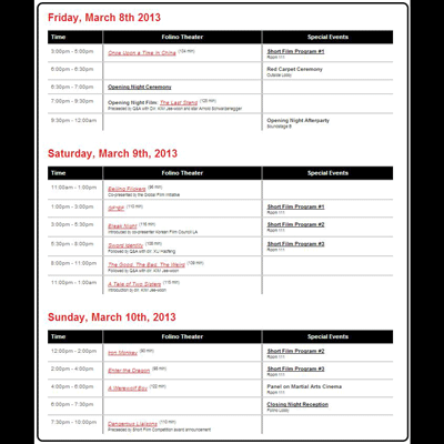
In addition to updating the schedule to the site's new style, the layout's markup was overhauled to rely less on tables and more on fluid columns, making the codebase easier to maintain.
Each page header was redesigned to be visually stunning, the parent festival's branding.
The previous eyesore of a footer was replaced by one using clean lines and a more legible font.
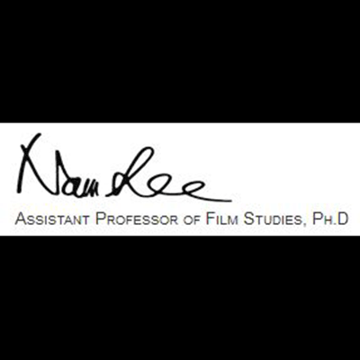
A custom graphic element was added to the Programmer's Note page, to give the message a more personal touch. It was designed using an electronic stylus, to capture the fluidity of writing.
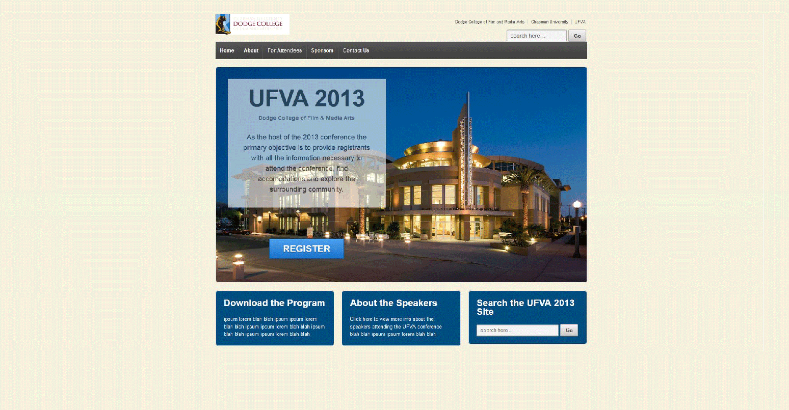
Before contracting with the proprietary CVENT registration software, Dodge College sought to design a custom website for the UFVA conference.
I created a handful of layout mockups, featuring responsive, fluid layouts created with advanced CSS techniques.
Once a general layout was selected, I created another batch of color treatments, exposing the responsive functionality of various elements throughout the site.
While a final design was approved, site construction stopped once the CVENT system was selected to administer the event registration, as the software did not support media queries, advanced css, or even editing its default HTMl templates.
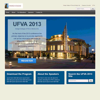
Presented with a full-width, fixed background image of the school at night, with darker colors and enhanced contrast.
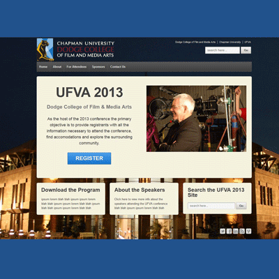
Similar to Treatment 1, this version used a different photo for the background, and experimented with larger szes for mobile viewing.
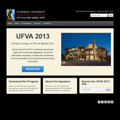
A radical change from the colorful treatments, this design was an attempt to streamline the information a viewer would be presented with on a mobile screen, and would better match our original school colors.
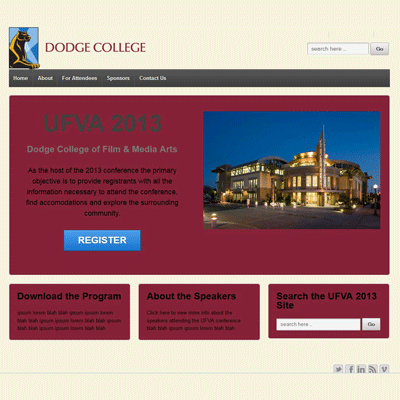
This treatment replaced the Dodge College color palette with Chapman University's, referencing the primary maroon color, and a toned-down shade of light gold.
Dodge College needed a way to show off the awesome content they were creating for students and alumni on the Students Website.
I designed a multi-stage process to funnel information from the Announcements, Congratulations, Events, Jobs, and Internships databases to plasma screens running proprietary display software.
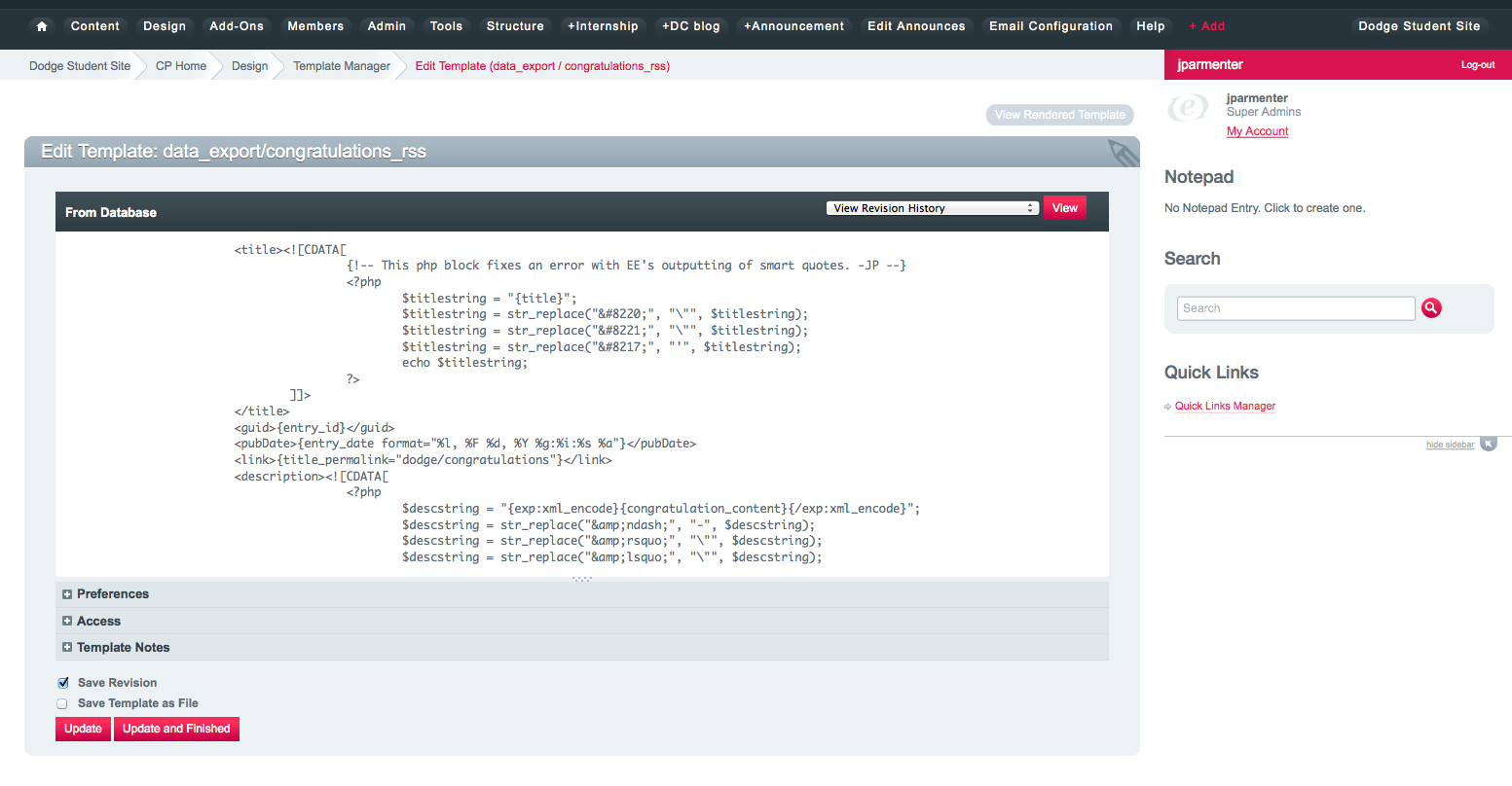
The data was exported to XML and RSS streams, parsing database entries into layout elements.
Working with an AV technician, we developed a template to display the dynamic content in a static layout at plasma screen resolution.
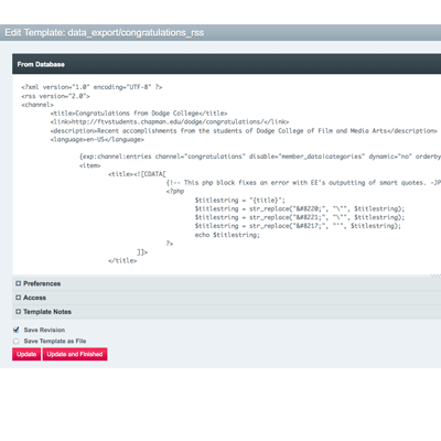
The ExpressionEngine interface I use to create custom RSS feeds. The bulk of the coding involves simple string substitutions to fix a bug in the way PHP and ExpressionEngine interpret each others' reserved symbol tags.
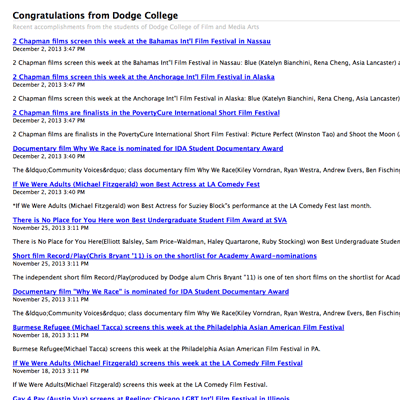
The routine pulls selected sets of data a SQL database, as dynamically specified by PHP intermediary files, and exports them into a structured data feed.
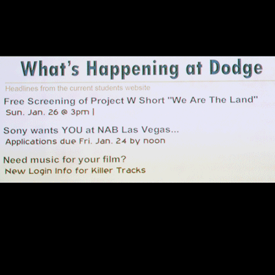
Pictured here, plasma screens scattered throughout the building rotate through informational slides all day, one of which is created dynamically from the feed. It updates in real-time, and ignores items whose date has passed.
I have been the lead author and chief editor on the Dodge College Blog since I joined Chapman University in 2010.
I produce daily content, highlighting the activities and successes of Dodge College students, alumni, faculty, and staff.
I recruit and manage guest authors, assigning tasks, scheduling posts on a communal calendar, and editing all posts.
I have written over 750 posts. My speciality is longform content, but I'm no stranger to brevity.
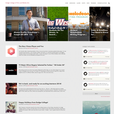
I oversee all the content and authors on the Dodge College blog.
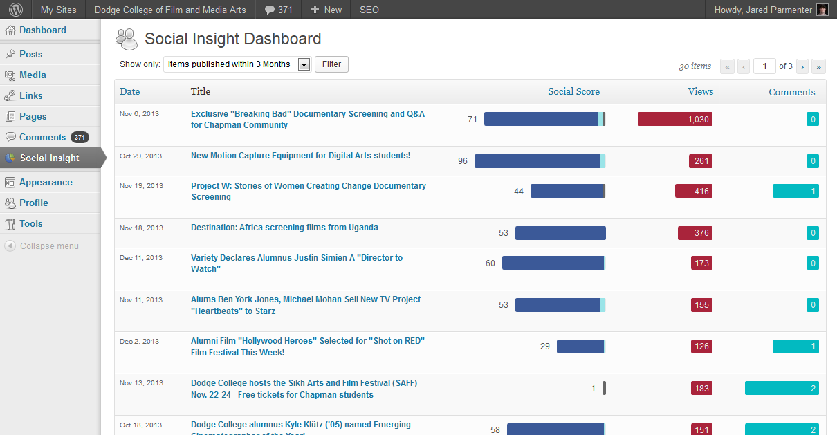
Here you can see recent headlines, a timeline of stories, and a widget aggregating a variety of social feeds.
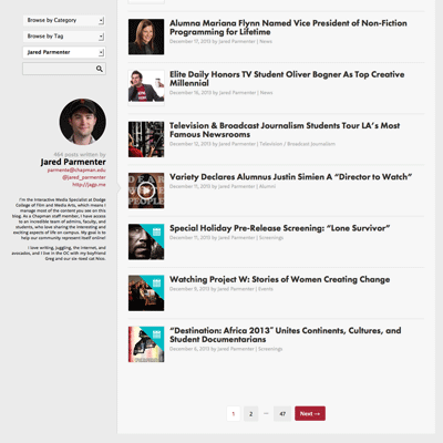
I am also the primary content contributor, writing on everything from school events, students awards, industry news, and more.
I've written about 750 posts in three years.
After graduating college, I began a WordPress blog with my friends, to share our thoughts on film and film criticism. Our basic motto is, "anything is worth watching."
I set up the site, including all the graphic design, layout, theme customization, DNS management, analytics, and general site administration.
Although I don't write as much now that my daily job includes daily writing, I'm still watching anything I can.
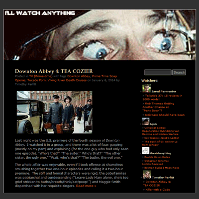
I hacked a popular WordPress theme with advanced functionality for displaying post metadata which was being discarded, customizing code for each of the index, post, and landing page templates.
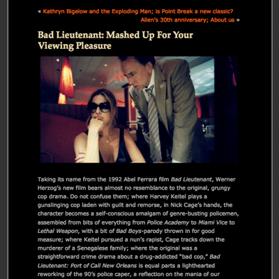
When I was writing regularly, I embraced the "I'll Watch Anything" philosophy, writing about under-represented, misunderstood, overlooked, or unfarily panned films.
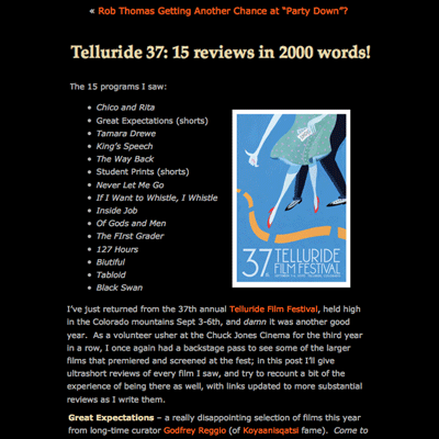
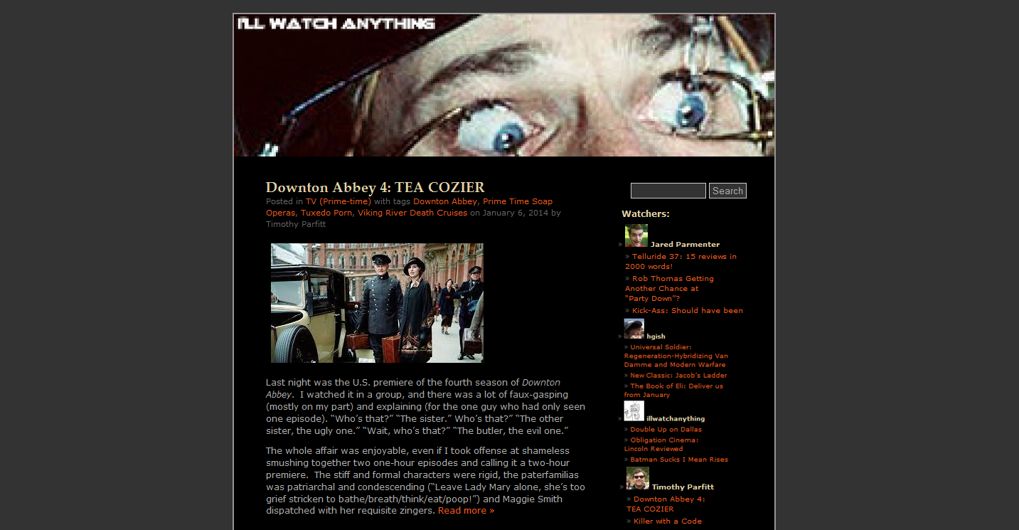
I also reviewed film events, for example the Telluride Film Festival, one post of which is pictured here.
In the summer of my Senior year in high school, I was contracted by a private company to produce a user's manual for their software product, Expertise2000.
I was the sole bug tester, responsible for investigating and documenting interface and operational bugs as I encountered them.
I developed the look and feel of the manual, including all the grahic design elements and copy layout. I primarily used robust, cascading Word styles.
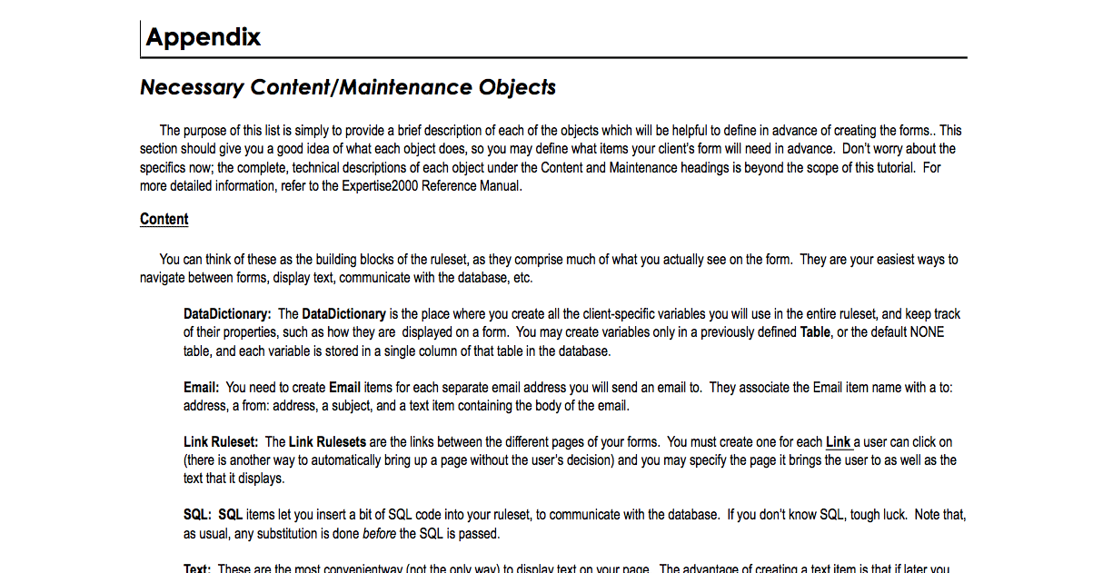
All told, the manual was 50 pages, including examples, practical exercises, and reference appendices.
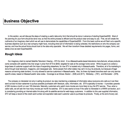
To illustrate many of the concepts I explained in the introductory sections of the manual, I used the metaphor of a fictional business. This technique grounded the concepts, and remained a touchpoint throughout the manual.
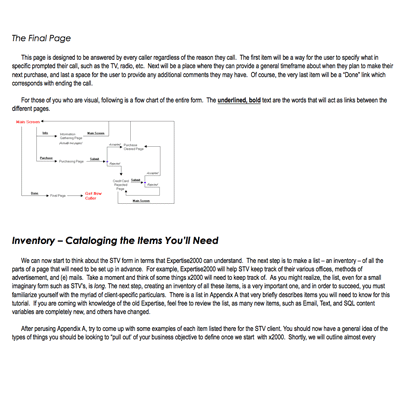
As the software produced not just forms but a set of rules which described a group of forms, the program used a level of abstraction which was often challenging to describe. Diagrams helped.
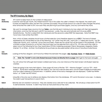
I laid out the entire manual's page design, from recurring styles to images to tables and appendices.